
CSS Tutorial: Style Table Rows To Look Like Cards
A client needed a more readable design for some of the tables on their website. The typical table styling was not cutting it, because the last column of said tables contained way more content than all the other columns. (Keep that in mind, while I use dummy content and a more generic styling in my explanation below.)
In addition, the tables were created automatically, with little influence on the composition of the tables in terms of classes, IDs or custom attributes, so using another HTML structure was not possible either.
The HTML is straightforward enough:
<table class="cards-table">
    <thead>
        <tr>
            <th>Column A</th>
            <th>Column B</th>
            <th>Column C</th>
            <th>Column D</th>
        </tr>
    </thead>
    <tbody>
        <tr>
            <td>…</td>
            <td>…</td>
            <td>…</td>
            <td>…</td>
        </tr>
        …
    </tbody>
</table>
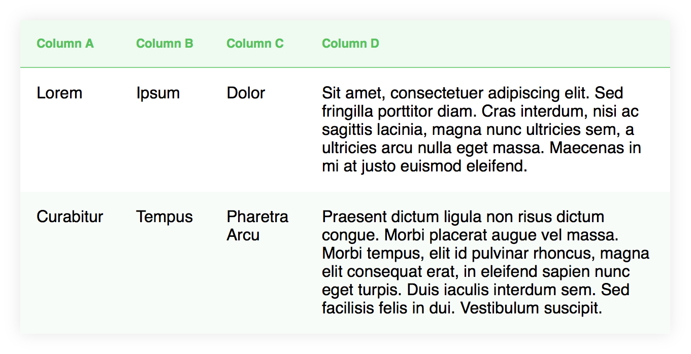
The regular table styling looks something like this:
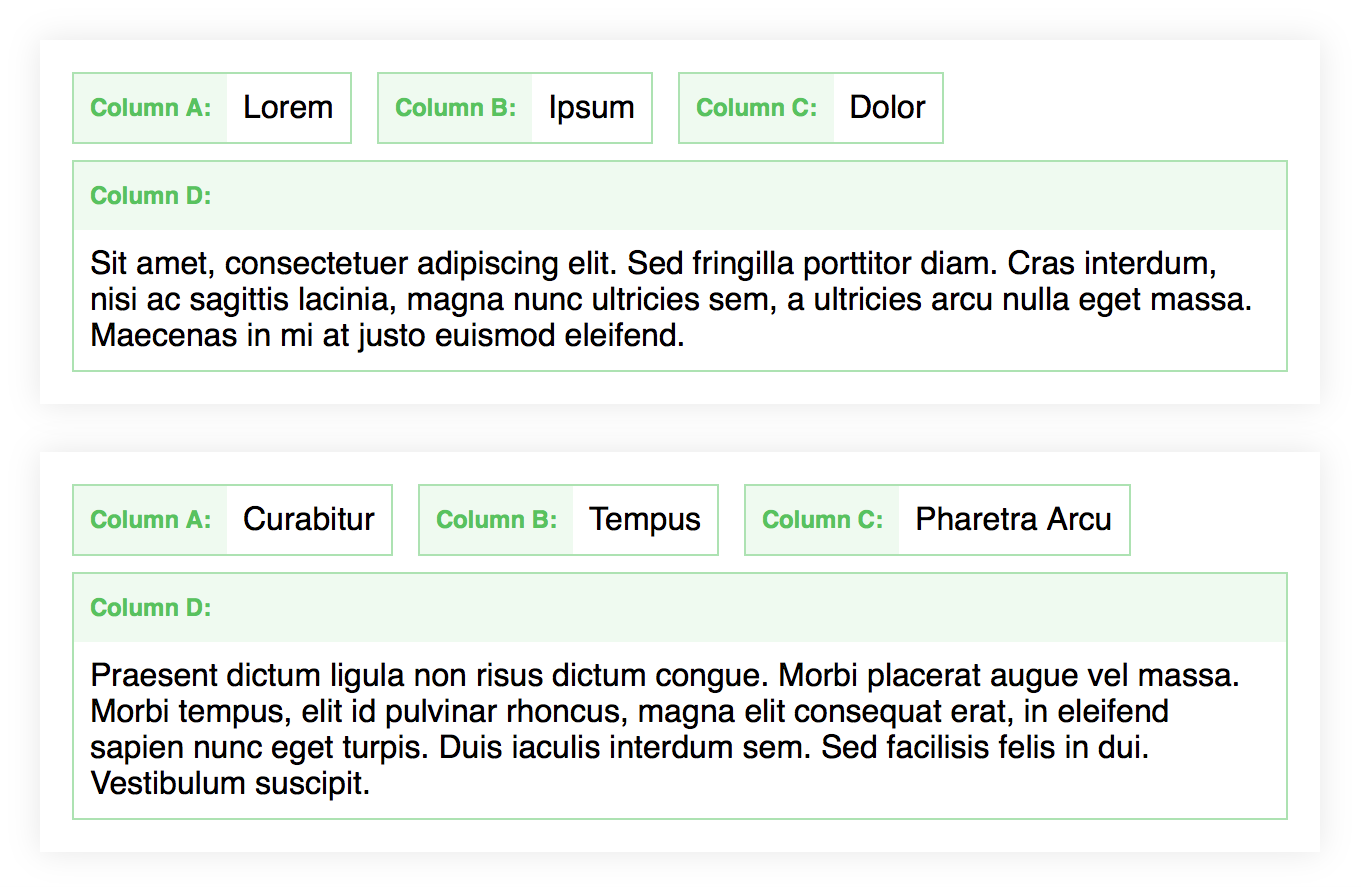
I suggested a card-like layout for each table row, that looks something like this:
The client liked the idea.
Let’s have a look on how to get from A to B.
(There is some SCSS sprinkled in here and there, but you can do the exact same thing with plain CSS as well.)
First, hide the table header:
thead {
    display: none;
}
Style the table rows to look like individual cards:
tr {
    display: block;
    margin-bottom: 1.5rem;
    padding: 1rem 0.5rem 0.5rem 1rem;
    background-color: transparentize( white, 0.15 );
    box-shadow: 0 0 1rem transparentize( black, 0.9 );
}
On to the individual table cells, basic styling first:
td {
    display: inline-block;
    margin: 0 0.5rem 0.5rem 0;
    padding: 0.5rem;
    text-align: left;
    background-color: white;
    border: 1px solid transparentize( #58C25F, 0.5 );
}
Now let’s add the labels. I decided to use pseudo-elements:
td:before {
    float: left;
    margin: -0.5rem 0.5rem -0.5rem -0.5rem;
    padding: 0.625rem 0.5rem 0.625rem;
    font-size: 0.75em;
    font-weight: bold;
    background: transparentize( #58C25F, 0.9 );
    color: #58C25F;
}
At this point the pseudo-element still has no content.
If the composition of your table is always the same, you might just define the label content row by row, directly in your stylesheet:
td:nth-child(2):before {
    content: "Column 2 Label: ";
}
For my use case I needed the labels to be dynamic:
- It had to work for variable table layouts and
- with multiple tables on the same page.
I decided to use a data attribute as the content source for the pseudo-element.
First, create a “data-label” attribute and attach it to every <td> with a bit of JavaScript/jQuery:
var tables = $('.cards-table');

// Create an array containing all table headers
var table_headers = [];
tables.each(function() {
    var th = [];
    $(this).find('thead th').each(function() {
        th.push($(this).text());
    });
    table_headers.push(th);
});

// Add a data-label attribute to each cell
// with the value of the corresponding column header
// Iterate through each table
tables.each(function(table) {
    var table_index = table;
    // Iterate through each row
    $(this).find('tbody tr').each(function() {
        // Finally iterate through each column/cell
        $(this).find('td').each(function(column) {
            $(this).attr('data-label', table_headers[table_index][column]);
        });
    });
});
Then, finally display the content using the attr() CSS function:
td:before {
    content: attr(data-label) ": ";
}
If you remember, the last column needed more space. It should span the whole width of the card.
At this point you could either use the :last-child selector, to target the last column/cell in a row, or, to make it even more flexible, use an attribute selector to target a cell, depending on its column header:
td[data-label="Column D"] {
    display: block;
    float: none;

    &:before {
        display: block;
        margin-right: -0.5rem;
        margin-bottom: 0.5rem;
        float: none;
    }
}
Bonus: To clean it up even more, you can just hide empty cells:
td:empty {
    display: none;
}
And that’s it!
Did I mention, that this is all completely responsive?
I hope you found this post useful. 🙂
You can find a complete code example on CodePen.